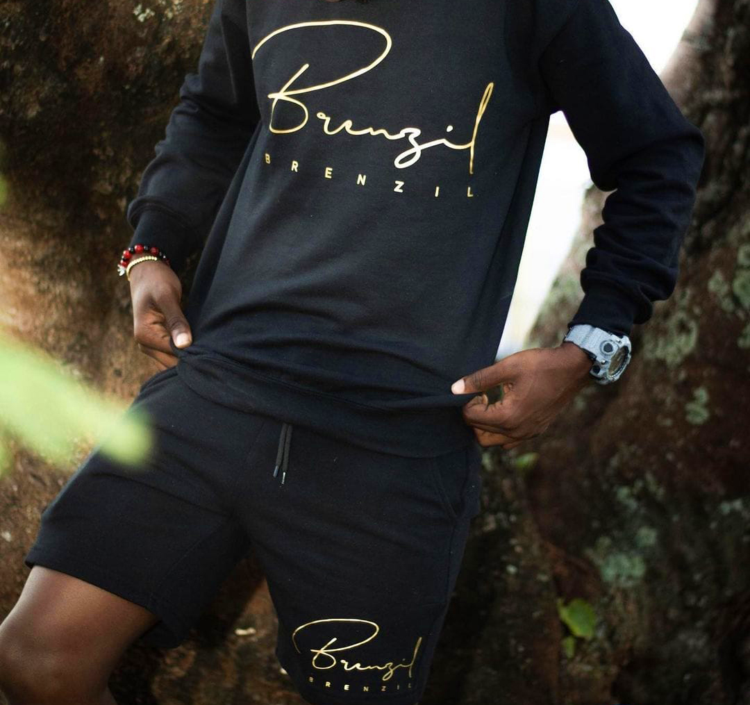
When tasked with exploring a logo design for our client Brenzil - a local, men's wear tailor and designer, we decided on a signature style that was indicative of the brand's flair for trendiness and elegance.
An overstated letter B and lower-case handwriting was designed to mimic both the glamour and frenziness of an autograph. We then repeated the word Brenzil in subtle, evenly-gapped lettering below for clarity and some visual-grounding.
With the client's approval, we finalized and the project was quickly moved to print production.


